Bullish Treasuries Chart Pack
We welcomed back bond bulls in late October, and now it's time to clear the path. Rates are heading lower.
Dear readers,
Prices always tell a story. Over a long enough time horizon, any price chart will eventually tell a story of growth, stagnation, or decline. Opening another semester of teaching rates, global macro, and the monetary system at USC Marshall School of Business this week, the first chart shown to students was a 60-year look at the 10-year US Treasury yield. The big debate is whether the story of the past 40 years—a vicious bull market—is over. I’m not so sure it is.
Voltage helps you solve the biggest problem with Lightning nodes and scaling. No more headaches with maintenance, reliability, or uptime issues. Voltage makes running Lightning instant and now easier than ever. These radical improvements to Lightning empower startups and enterprise brands to bring incredible applications and services to market. You can also spin up a personal node and pay by the hour. Scale your infrastructure as fast as Lightning itself.
Create a node in less than 2 minutes, just visit voltage.cloud
Today’s Topics
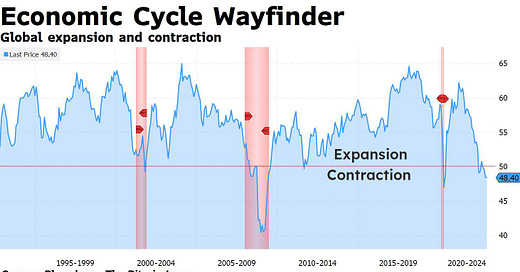
A check of TBL’s Economic Cycle Wayfinder: the economy, despite robust payrolls, is exhibiting leading characteristics of contraction.
We are now only one blip away from curtains on the hiking cycle.
Behavioral price support and resistance on 2- and 10-year Treasury yields.
Behavioral price support and resistance on S&P 500 and bitcoin.
The answer is slower, what is the question?
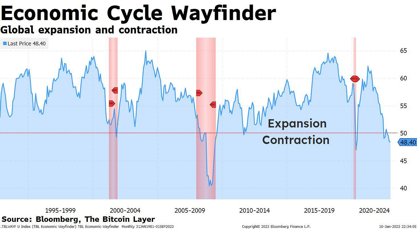
Our barometer for the US economy, the TBL Economic Cycle Wayfinder is a synthesis of three of our most reliable data sets that come together as a temperature check. The individual components are all surveys. Questions are asked to managers of manufacturing firms (ISM Manufacturing), owners of small businesses (NFIB Small Business Optimism), and consumers (University of Michigan Consumer Sentiment) about how economic participants are feeling now versus last month. Are you more or less likely to buy a washing machine? Are you planning to hire or fire people? Are you seeing more or less new orders for your products?
Our Wayfinder simply tracks growth and can help identify recessions due the fact that all three subcomponents have strong track records of strongly correlating with the economy and GDP. And right now, contraction is the name of the game. In this chart, you’ll see our Wayfinder using the 50 line as a swing point of expansion and contraction, and while the periods below 50 do not exactly correspond with recessions, the data is extremely high signal. The US economy has been struggling with low growth for about six months now and has not seen accelerating activity for a year and a half. Look at the times over the past few decades in which the Wayfinder was below 50 (red shaded areas are official recession periods):
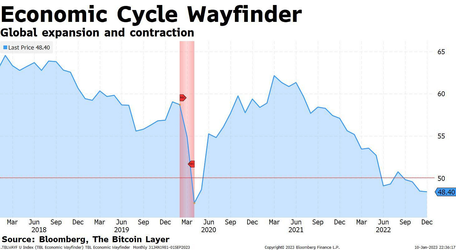
And take a look at just the past five years—you’ll see a post-pandemic bounce that has faded entirely, a trend that has been with us since mid-2021:
This is all to say that inflationary impulses of 2021 and 2022 have also faded, and the Fed, which has hung its hiking hat on 7-9% inflation for rapid rate hikes, is all of a sudden about to encounter the opposite problem. To cut to the chase:

Markets have been trading like the Fed pause is almost here, but a CPI print on Thursday will help solidify what is going to happen at the next FOMC meeting in February, hike or pause.


