Chart Pack: Quiet Fed, Loud Markets
Markets are starting to paint a picture of something dire: a very strong dollar. Charts on rates, oil, FX, and bitcoin's dwindling correlation with stocks.
Dear readers,
Every now and again we like to write a markets update without mentioning the policymakers at 33 Liberty Street in New York or the Eccles Building in Washington. The problem with their testimonies, press conferences, and general ramblings is that never once are we able to separate facts from political messaging. It leaves us to fend for ourselves in economic analysis, and today, that’s exactly what we’ll do. Let’s tour the markets, discuss why record-low volatility and solid equity performance don’t paint the full picture, and see the danger looming in FX land.
Envoy is an easy-to-use Bitcoin mobile wallet with powerful account management & privacy features.
Set it up on your phone in 60 seconds then set it, forget it, and enjoy a zen-like state of finally taking your Bitcoin off of exchanges and into your own hands.
Download it today for free on the iOS App Store or the Google Play Store.
Should we feel calm?
During the early days of May, markets started to seriously rebound from the brief (but not buried) midsize regional banking crisis in the US. S&P 500 increased about 10% before last week’s stall, rate cuts by the end of 2023 vanished from money market futures curves, and fears of a recession beginning in Q2 had lifted from the consensus.
The first thing we must do before proceeding with today’s chart analysis is segregate the performance of stocks (and the corresponding plunge in volatility as the VIX touched a 12-handle last week) from the rest of markets. A 10% rally in stocks is fine and dandy, but we believe the rally, the source of which we have discussed is likely a supportive liquidity wave stemming from BTFP, the FHLB system, Treasury’s cash build coming almost exclusively from RRP, and a stubbornly slow QT process. BTFP and FHLB boost system liquidity, while the Treasury cash build and QT are both expected to harm liquidity but neither is showing up in a sizable enough way.
With risk assets performing well despite the gloomy macro outlook we keep discussing, let’s assess if other asset classes are confirming or denying the story told by stocks and at the same time possibly identify something dangerous. News flash—it’s the dollar.
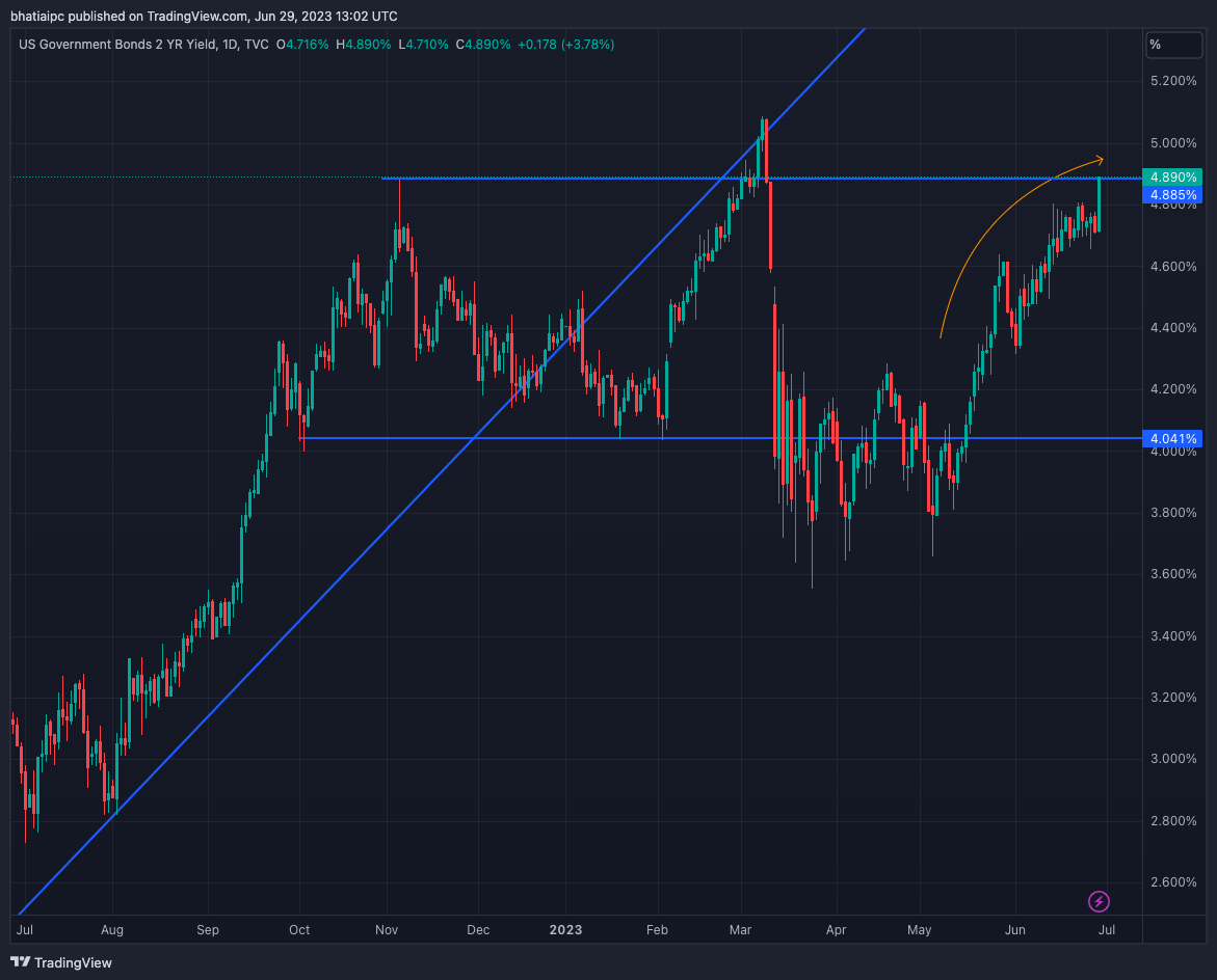
If the first week of May marks the starting point of our analysis, let’s glance at our first chart, 2-year Treasury yields, and determine the strength of the current trend. As a baseline, think of rising 2-year yields as a sign that policy rate expectations are staying elevated or even increasing, which is generally a sign that the economy is on firm footing. We argue that while starting with a strong charge higher in yield, 2s have lost momentum here, even with today’s pop due to decent GDP:
The orange arrow is an attempt to mark the area around 4.75% as a level to watch. Essentially, above 4.75% on 2s suggests investors believe the hiking cycle has not concluded—future increases to Fed Funds would be in play. Below 4.75% and investors are instead thinking that cuts are much more likely over the next year than anything else. While a very rough demarcation, the spirit of our argument is strong—from a behavioral perspective, a 2-year yield that refuses to challenge 5% indicates a market completely unwilling to entertain the “all is good” attitude present in stocks. Which other assets, we wonder, would agree with 2s’ characterization of the market as cautious on growth, inflation, and policy rates?


