FREE POST: $10 trillion in cumulative deficits
We begin with bitcoin analysis. The interaction between deficit spending, asset prices, and the economy.
Dear readers,
Have you been too bearish on the economy, expecting a recession to be right around every corner for the past couple of years? It’s ok to admit it—a year ago, when banks began failing, I couldn’t have imagined no recession would set in by now. In fact, I thought it was beginning at that moment. Over the past several months, however, it has become clear that the resilient US economy is instead super-extra-persistently resilient, and the reason is fiscal spending. Last year, readers insisted we read up on the 1940s and start admitting that restrictive interest rates are playing secondary to deficit spending.
As a researcher, I also admit to you today that I’ve been reading a healthy amount of financial research papers, listening to interviews with monetary experts, and overall sinking deeper into learning mode. Thankfully, I have an incredible data tool that allows me to convert my research into visualizations for you, the reader—today, we share updated views on fiscal dominance, inflation, and the monetary system, courtesy of a writer who is frankly just obsessed with trying to figure it out. Aren’t we all?
River is our Bitcoin exchange of choice.
Securely buy Bitcoin with zero fees on recurring orders, have peace of mind thanks to their 1:1 multisig cold storage custody, and withdraw at any time. Need help? They have US-based phone support for all clients.
Now introducing River Link 🔗allowing you to send Bitcoin over a text message that can be claimed to any wallet. Give a gift, pay a friend for dinner, or orange pill your friends, completely hassle-free.
Use River.com/TBL to get up to $100 when you sign up and buy Bitcoin.
Today’s topics and 11 charts:
Realized price is hot
Fiscal dominance, deficit spending, and delayed recession
Relating the deficit and yield curve
Inflation refresh
Relating T-bill issuance, equities, and deposits
On-chain matters and it’s screaming
You might be bored with us hammering the table on realized price or still struggling to grasp the concept. Either way, we are back for yet another opportunity to scream it from the rooftops: bitcoin’s realized price is starting to look parabolic. This is not bitcoin’s market price, which has skyrocketed in early 2024, up 184% on a trailing 12-month basis. We are discussing bitcoin’s realized price, which is the weighted average price at which bitcoin last moved on-chain, not traded on an exchange. The important distinguishing aspect of realized price is that most of its changes occur behind the scenes—the price moving suggests that bitcoin is being transferred by using the blockchain itself.
How is it that realized price is increasing at such a pace these days? As ETF managers purchase bitcoin and move it to their vaults, blockchain transactions are occurring, and each time a little slice of the network attains a higher realized value.
We are seeing a move now reminiscent of the beginning of past major bull markets. It will be key to watch how high realized price can climb—the higher it climbs, the higher bitcoin’s market price can climb as positions as aggregate profitability would be capped. If bitcoin’s realized price stops climbing, it means that all moves in the price are by speculators instead of users, such as ETF shareholders.
This parabolic move is something you must understand and interpret as exceedingly bullish:
We have an incredible charting tool with Macrobond, and it is my personal mission to build TBL into the full-fledged research product that readers deserve in this fast-paced, incredibly noisy world.
Where is the recession?
No recession arrived alongside the fall of Silicon Valley Bank, and no recession arrived after at least a year of realized 4%+ policy rates. Judging by spot GDP and ISM services, no recession will arrive after at least a year of realized 5% policy rates. What gives? The short answer is fiscal spending. Before we go off into the dangerous territory of why we won’t have a recession this cycle for another few years, let’s keep readers grounded in data. This week’s JOLTS employment data was mixed, but looking closely shows us that quits continue to decline, implying jobseekers are not very confident in leaving their current positions as the quality of available jobs declines:
Now that we got our one bearish economic chart out of the way, let’s look into some more data to summarize why the US economy is pumping out such strong nominal growth. Here is a chart of the US deficit (surplus if above the red zero-line) relative to GDP, currently showing how our deficit is almost 6% of GDP, territory only consistent with the 1940s and World War II:
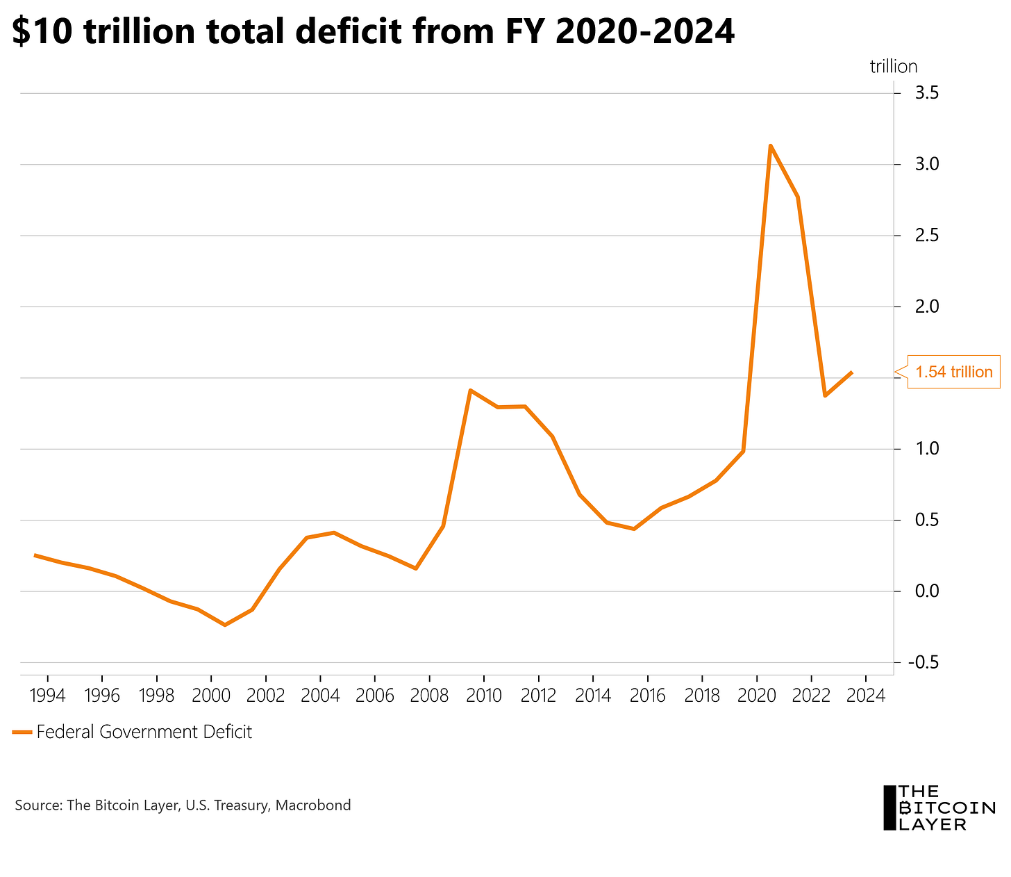
How much money is this in cold, hard cash? Including what is tracking to be another trillion-plus year, we are heading for a five-year period during which the cumulative deficit and therefore total debt expanded by $10 trillion. Where is that money going? Into the checking accounts of American government contractors, which then gets circulated back into the economy, Treasury securities, and other forms of shadow money, such as money market funds, which then help fund securities holdings through the repo market. This is another way to say that the money ends up coming back around, pumping the business activity, risk-taking activity, and sentiment required for a robust economy.
An interesting thought exercise is to look at the year the fiscal deficit was above $3 trillion and think how much time that money is taking to make its way through the system and lift all boats, but then also think about how the following four fiscal years have not brought reprieve—they brought record-spending:
Is more economic analysis needed, or can we just attribute the entire last year to the government? NVIDIA and the AI boom would disagree as is evidenced by technology’s outperformance. And on the flip side, if the government keeps spending, the party will continue, right? On the surface yes, but our experience tells us that when everybody assumes something will happen, there’s usually something hiding.
On that note, everybody including ourselves is aware of looming bad debts in commercial real estate and how that will impact banks. As a challenge to myself, I’m instead spending time thinking about from where else problems may arise, such as private debt, offshore dollar debt, and obscure derivatives markets of which I am unaware. It’s not exactly easy to go looking for problems you don’t know much about or even know exist, but then we wouldn’t be thorough research scientists.
Are the deficit and yield curve related?
In the spirit of maneuvering data in order to understand the 1940s better, I plotted the deficit against the yield curve. It then made sense to invert the yield curve to better relate both time series. But first, let’s discuss why I decided to look at the yield curve.
In some recent readings, I came across an investment researcher who put forth that the yield curve, during massive fiscal deficits, is a less reliable indicator of looming recessions. That made me pause, especially because of how reliable the yield curve has been as an indicator for the past several decades. But if we require a century of data and not just a few decades to understand the true reliability of the indicator, as Michael Saylor would say, your models are destroyed.
My interpretation of this chart is that as deficits rise (orange line going down), generally the curve steepens. This is probably because deficits rise during recessions, during which the Fed has cut rates and steepened the curve (black line going down, since this axis is inverted—I probably should have flipped the deficit instead of the yield curve, which I did in a later chart). This time looks to be different, as large deficits come with a very inverted curve. Also, the comparison to the 1940s wasn’t informative because the Fed/Treasury pegged yields during that decade:
The researcher, who I will be interviewing on our channel in two weeks, also mentioned that the US Treasury yield curve (orange) is not as informative as the spread between mortgage rates and funding rates (black). I’ll be thinking more about this but wanted to share the thought with you in the interim. The curve is flat, which is punitive to banks:
Some are suggesting that the Fed must cut simply to steepen the curve, completely independent of the economic and inflation situation. I find that argument compelling, especially with the Fed insisting that cuts are coming despite such strong nominal growth.
A more formal inflation outlook
Structural inflation due to massive fiscal deficits cannot be reversed by “restrictive rates” and the second-order economic-led disinflation—that seems to be the argument for sticky inflation and soft landing or no landing scenarios. We believe strongly that the quantity of money in the system, somewhat influenced by central banks but more so by private sector banks, will have the larger impact ultimately. Overall balance sheets appear to be on the rise, not allowing for the time value of money to decline. Treasury yields might be a less perfect picture of that, and mortgage yields might be better. Again, a concept that isn’t necessarily traditional (I was trained to view the Treasury curve as the best expression), but something to put out there until we can continue to flesh it out:
Treasury issuance, equities, and deposits
To close out our closer look at fiscal deficits and this period of fiscal dominance, let’s think about the deficit from a monetary perspective. When the Treasury spends money into the economy, deposits are created. Those deposits might get destroyed and replaced by other forms of financial assets and bank funding, therefore disappearing from M2-type statistics, but we can see via GDP that the government’s money is going a long way. In orange, we see the gross amount of Treasuries issued per month, but the impactful number is net, in purple:
Here is a zoomed-in view of net issuance. The takeaway from the visual is that historically, the government experiences months in which it doesn’t need to issue as many securities as matured due to tax revenues or healthy cash balances—those brief surpluses appear to not even exist anymore:
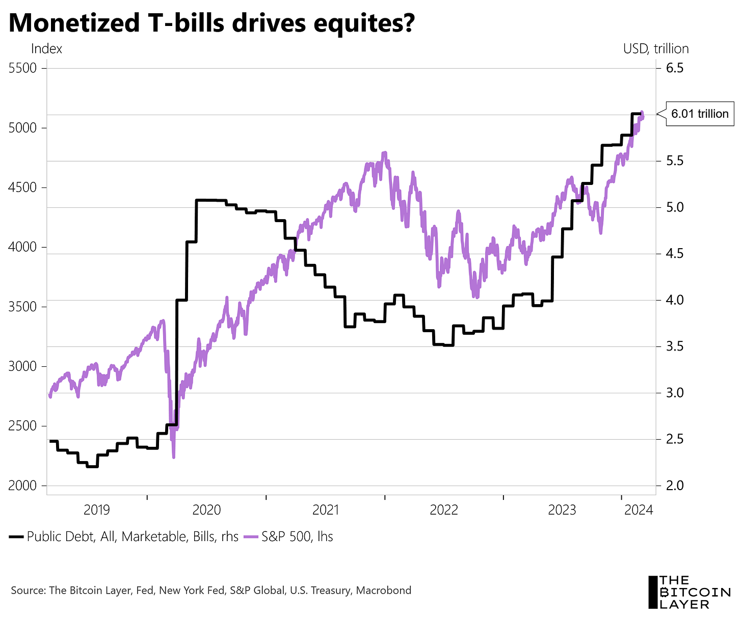
There is simply too much money sloshing around. A lot of the issuance is coming in T-bills, which I overlayed with the stock market. Instead of thinking about central banks printing money and how more reserves lead to more risk-taking, what if the impulse was simply the Treasury paying bills and creating money? It certainly could be:
To close, a final monetary thought exercise. Treasury spends money into the economy, deposits skyrocket, but deposits leave in order to finance broader risk-taking—imagine something like the money starts in the economy but eventually ends up financing banks that are leveraging wholesale funding:
And that brings me back to my ultimate point. We are unable to measure risk if we don’t know where it is. Stick with us to continue the search. Lastly, we always encourage you to freely redistribute any of our charts that you find interesting along with your own thoughts.
Until next time,
Nik
River is our Bitcoin exchange of choice.
Securely buy Bitcoin with zero fees on recurring orders, have peace of mind thanks to their 1:1 multisig cold storage custody, and withdraw at any time. Need help? They have US-based phone support for all clients.
Now introducing River Link 🔗allowing you to send Bitcoin over a text message that can be claimed to any wallet. Give a gift, pay a friend for dinner, or orange pill your friends, completely hassle-free.
Use River.com/TBL to get up to $100 when you sign up and buy Bitcoin.


Hey Nik, one question about realized price: Not saying it is the case now (as I also definitely think the latest increase is coming from ETFs moving their holdings into cold storage) but is it not possible that increased selling mentality would also raise realized price? If I move dormant coins to an exchange in order to sell that would also drive up realized price wouldn't it?