Dear readers,
I have a confession to make. I always preach “price is truth,” but I have not been charting like I used to. Thankfully for all of us, those times are over.
Layered Money took everything I had, intellectually, emotionally, and physically. Roughly one year of writing (2020) and one year of promoting (2021) later, I realize how much time I’ve spent away from a Bloomberg terminal, and how much I miss it.
For a trader, the terminal is your life. The charts, watchlists, and newswire become your anchors to the point of dependency. Breaking that dependency was a gradual process for me, but over 30,000 happy readers and 14 languages later, I can safely say the transition has been worth it.
“Price is truth” means the price tells the story, regardless of the narratives and sometimes even the data. It is an assumption that the market price is smarter than everybody, and the price’s time series tells the truth more than anything else does. Those time series can be viewed in a graphical form, or what we call charts.
Charts are my religion. They govern my research framework because they are the loudest expression of the narrative. Charts tell you what’s happening, not the news. I prefer to infer the news from the time series of prices instead of trying to make sense of prices’ reactions to headlines. And how prices change through time is almost more important than what the prices actually are.
For the past couple years, the charting I do can be classified as sparse compared to my past. Yes, I always have an intraday chart of bitcoin going in my three-screen setup, and yes, I always have a browser tab dedicated to Treasury yields. But my watchlists and weekly chart runs have largely been absent. The Bitcoin Layer made me realize that my best self as a researcher is when I’m charting, so today, I’m bringing back my chart runs.
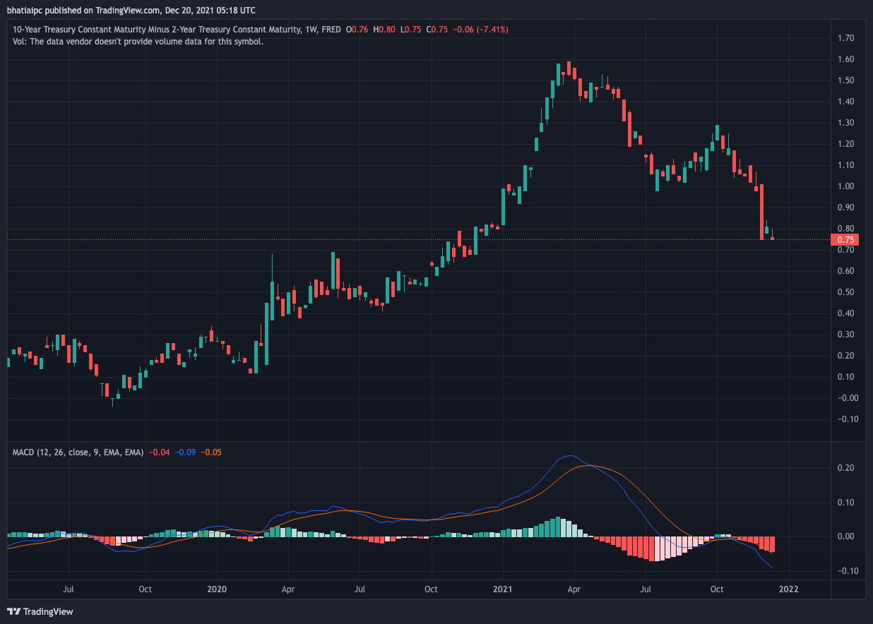
In these charts, each candle represents one week of price action. In this way, each chart will tell a multiyear story. In no way are these charts meant to be trading advice. Our goal is to understand the stories that various prices are telling us about the state of the world and the investment opportunities within.
Holiday chart pack
US Treasury 10-year yield
US Treasury yield curve (10-year minus 2-year)
Nasdaq 100 ETF (QQQ)
Bitcoin
US Treasury 10-year yield
Chart:
Story:
The US Treasury 10-year yield is still the world’s risk-free asset. Its yield heads lower when there is fear in the world, as investors sell other assets in favor of the safety of Treasuries. Since the pandemic rates collapse to start 2020, the 10-year yield has been in a steady uptrend, as investors sell Treasuries and invest in riskier assets. The last half-year has been a different story, however. Yields peaked in March of this year and have established a bit of a downtrend. Looking at the chart’s momentum indicator (bottom panel), yields are starting to gather momentum to the downside. When looking at the uptrend since March 2020, yields are dangerously close to disrespecting that line of support. If yields do make a move below support, more followthrough is likely.
What is this saying about the world? Investors are worried about one thing: avoiding risk. Even though statistics range from 6.8% US consumer price inflation to an astounding 19.2% annual increase in German producer prices, long-term investors are much more concerned with a 10-year return of capital than hedging today’s obvious and somewhat dramatic inflation. In the face of all this inflation, such low yields are an even more troubling tale. The market understands two things: 1) the US government cannot sustain higher yields, and 2) the broader market cannot tolerate higher yields, and any liquidity crisis will immediately be met by central bank asset purchases. These two major forces prevent Treasury yields from achieving a long-lasting uptrend and can cause a rapid decline when investors simultaneously come “home” to the safety of US Treasuries.
US Treasury yield curve (10-year minus 2-year)
Chart:
Story:
I’ve written a lot about the yield curve this year because the difference in 2-year yields and 10-year yields tells us a lot about investor expectations, and yield curves have phenomenal predictive power when it comes to turns in the economy and Federal Reserve monetary policy. Historically, when yield curves flatten aggressively and eventually invert (10-year yield falls below 2-year yield), it signals a recession and forces the Fed to cut rates in order to bring short-term yields back below long-term yields. Looking at the yield curve since May tells a story that the Fed’s hawkish approach to 2022 monetary policy is not going to turn out well. If the Fed gets three interest rate hikes in next year, the curve is predicting that the rate increases will significantly slow the economy. Right now, there’s nothing that is preventing the yield curve from inverting over the next year as the Fed stays committed to raising short-term rates.


